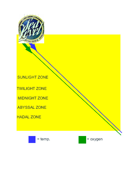
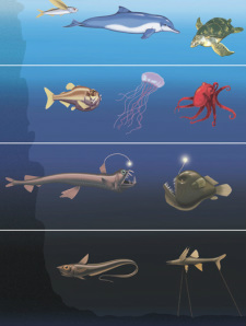
This is a graph that I created. It shows sea level and all 5 zones that we are studying now. It is supposed to show that both oxygen level and temperature go down at the same time while you get lower. If you compare it to the image under it, then you can see what the temperature is like for each zone, and which fish live in what temperatures.